
Stunningly beautiful or a Frankenstein’s monster?
The tips and pitfalls in upgrading historic buildings with contemporary touches.
There’s an undeniable beauty in an old building that exudes history, life, and character, and adding innovative extensions or updates can create breath-taking homes, schools, and office spaces. Despite this, there is no doubt that bringing historic buildings into the 21st Century needs an expert touch if you are to avoid a horrible hybrid.
Here at NJ Architects, we’re often given the tough task of creating a cohesive design that incorporates two design aesthetics. Whether a client likes different styles, a couple has opposing tastes, or an existing structure has an identity of its own, the challenge of melding differing designs is real.
To expertly combine the worlds of old and new, it is essential to be open to ideas and listen to your architect. Sometimes the problem with blending design styles is an innate resistance to it. If you have a listed building, an agricultural barn, or an industrial warehouse, it’s tempting to plan all your development around the ‘theme’ of the original. A chalet bungalow by the sea doesn’t have to be filled with blue and white beach-hut themes. A rural farmhouse can have an ultra-modern kitchen. A city apartment can have rustic touches.
An important aspect of successfully fusing styles is having a framework on which you can layer your ideas – this can stop confusion and avoid that ‘split personality’ look. Your framework might be dictated by the age of the original building, the way you plan to use it, or simply deciding which style is your favourite. Your secondary aesthetic can be designed to complement and support rather than compete.
The key to blending old and new is to embrace the original and then add your own personality. Taking out interior walls or adding a tiled roof alongside an old thatch might create interesting textures – or a hideous Frankenstein’s monster.
It’s a useful exercise, when considering two seemingly different styles, to look at the elements they have in common as well as the differences. Take a rustic look versus an industrial: the former suggests soft textures, earthy materials, and natural colours. With the latter we expect exposed brick, pipework, and metal beams. In fact, all of these elements would be found in both the factory and the farmyard – stripped back, functional environments that work very well together.
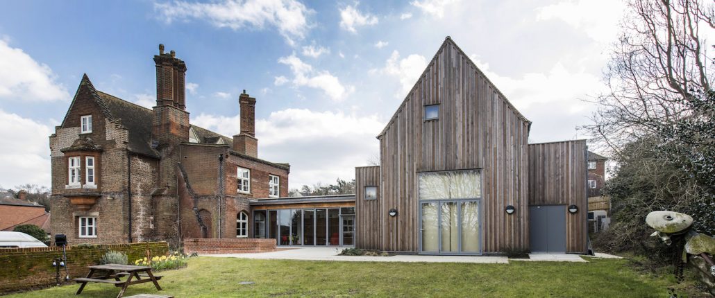
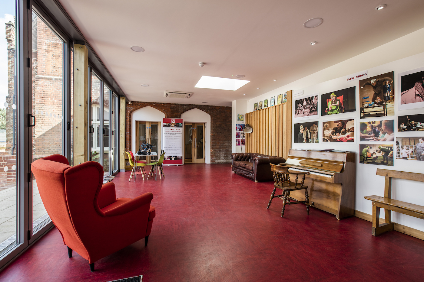
Gippeswyk Hall, Suffolk
We took on this innovative project on behalf of Red Rose Chain Film and Theatre Company.
The 16th Century, Grade II* listed building had a ‘temporary’ 1960’s pre-fab building attached to the rear. Red Rose wanted a new barn-like studio and accommodation, linked to the red-brick hall by a flat-roofed foyer.
We designed a small, timber-framed workshop to sit behind the existing garden wall for set building. In conjunction with Charles Curry-Hyde LLP and a Heritage Lottery Fund grant, we worked on the refurbishment and repairs, as well as alterations within the 19th Century extension to create a modern, functional kitchen.
Whatever design elements you choose, thread them through the property to create a sense of balance and cohesion. You could, for example, use the same wood from your mantelpiece on your staircase. You could use the colour of the original hallway walls in a new kitchen extension.
And if you have one big idea, one central feature, talk to us right at the start. However outlandish it may seem, as long as it’s not just stuck in at the end, it might just work!
In the immortal words of Edward de Bono, “There is no doubt that creativity is the most important human resource of all. Without creativity, there would be no progress, and we would be forever repeating the same patterns”.


